
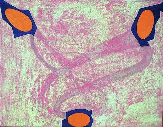
pink


Karim Ghelloussi @ L'espace d'art Le Moulin
this is a post about the use of pink
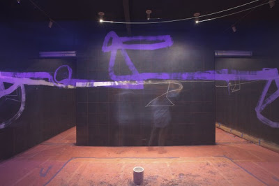
the idea came to me after visiting the expo of Karim Ghelloussi @ L'espace d'art Le Moulin.
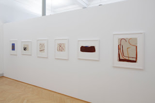
KG use of pink connects the different works in the space
and creates a kind of a lyric voice-over to the ensemble of works
(photos, installations and sculptures)
the boat in the picture has a stunning effect
when seen after visiting the tree
with the empty pink moon
or the Henry moore like birds sculpture
suddenly it all make sense
the profoundness of his work becomes clear
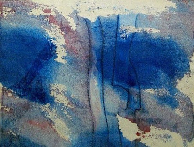
since the key to understanding this expo was the use of pink,
and since i was deeply moved,
i went out to look at what other painters are doing with their pinks.
its an extraterritorial kind of color.
it has an oriental flavor to it but also a sense of familiarity like an old object from grandma`s house .
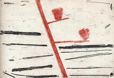
excuse me for including one of mine,
u are welcome to suggest one of yours or others
here goes:

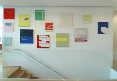
Martin Pfeifle

Sebastian Dacey

yifat gat

clem crosby

Hanns Schimansky

david rhodes

jurgen partenheimer

Fergus Feehily
Thomas Nozkowski

Monika Grzymala

Paul Pagk

Donald Judd
Pat Steir


A voir... Toulon (83), "Dessins contemporains du musée d'art & la collection Philippe Piguet", Musée d'art, du 5 mars au 29 mai 2011.

Claude Viallat, sans titre, 1977, tempera et gouache sur papier, Musée d'art de Toulon
Jeu de voisinage entre la collection du Musée d'art de Toulon et une sélection de 69 dessins de ma collection, orchestré par Brigitte Gaillard, conservatrice du musée...
Un jeu singulier et prospectif qui permet de jeter un regard autre sur des aventures parallèles mais différentes... L'occasion aussi d'un regard sur les années 1980-2010...
http://philpiguet.over-blog.com/
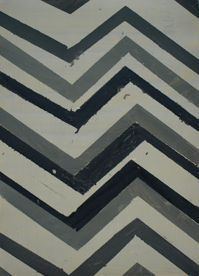
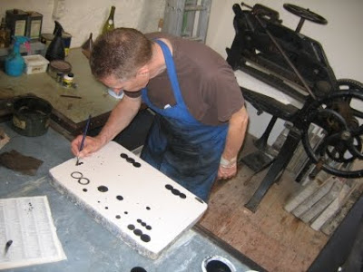
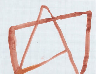
saturday quickie/ yifat gat
oil on 300 gr paper , 70x100cm
last studio shot film before moving to the new one
this was a very cold work space but it had incredible light
this was a very cold work space but it had incredible light
http://www.yifatgat.com/
DRAWING NOW PARIS

For its fifth year, the Salon du Dessin Contemporain is becoming DRAWING NOW PARIS. This Anglicism is not an affectation, but a way of clearly indicating the fair’s international dimension.
Nearly 30% of galleries are European this year, and more specifically German, Swiss and Belgian.
The first European fair exclusively dedicated to contemporary drawing, DRAWING NOW PARIS is a forum for exchange between every generation of artists represented by the exhibiting galleries. That is why we felt it important to open a new space, DRAWING NOW / LA MEZZANINE dedicated to young galleries (less than three years old) presenting an artist aged under 35.
Contemporary drawing is a means of expression combining graphic arts with new technologies, allowing a comparison between all today’s different drawing styles. DRAWING NOW / NUMERIQUE will also present a collection of digital drawings to provide a better understanding of this discipline so full of potential discoveries, and DRAWING NOW PARIS I SUITE... reveal the many forms that may take contemporary drawing.
A meeting place for in-the-know collectors who can acquire rare works by recognized artists whose drawings are hardly presented anywhere else. A place of discovery for young collectors who can finally access original pieces by emerging artists!
A place for quality networking between gallery owners, artists, collectors, institutions and contemporary art lovers, in a few years this fair has established itself as a key event in the contemporary art calendar.
DRAWING NOW PARIS I LE SALON DU DESSIN CONTEMPORAIN will reveal the full range of contemporary drawing from 82 European galleries at the Carrousel du Louvre, from 25th to 28th March 2011.
Christine Phal, president of DRAWING NOW PARIS / LE SALON DU DESSIN CONTEMPORAIN
http://www.salondudessincontemporain.com
Ronald Noorman
Another recommendation by L
thanks again
here are the links:
http://www.galeriewernerklein.de/artist.php?p=2&id=47&l=2
http://www.artistsbooks.be/artists/noorman.htm
http://www.depont.nl/en/press/press-releases/release/pers/ronald-noorman/
http://www.galeriewilliamwauters.be/ronald%20noorman/
Ergo Pers / artists books
books, prints and drawings by masters of drawing
great works all over the site
great works all over the site
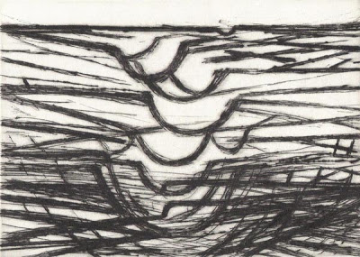
Hanns Schimansky, etching for The Recital, 2009
Ergo Pers is primarily a publisher of artists books, first editions of Dutch poetry and editions of French or English poetry in translation. Since its founding in 1995 Ergo Pers has brought together writers and artists to explore verbal and visual relations, such as Pierre Alechinsky, Armando, Jürgen Partenheimer, Hanns Schimansky, Ronald Noorman, Jacques Dupin, Hugo Claus, Reinier Lucassen, Dan Van Severen, André du Bouchet, Yves Bonnefoy, Pierre Reverdy and Jerome Rothenberg.
Recently Ergo Pers published a livre de peintre with John Ashbery, one of America’s most innovative and influential poets—an exceptional artist whose work stands alongside the finest of Whitman, Dickinson, Stevens, and Hart Crane.
Recently Ergo Pers published a livre de peintre with John Ashbery, one of America’s most innovative and influential poets—an exceptional artist whose work stands alongside the finest of Whitman, Dickinson, Stevens, and Hart Crane.
http://www.artistsbooks.be
Suzan Frecon

Photograph by Jamme
One Sunday afternoon last month at Suzan Frecon’s Hell’s Kitchen studio, Rail’s consulting editor John Yau spoke with the painter about her new body of work which will be exhibited at Peter Blum Gallery from November 17 to January 14, 2006.
John Yau (Rail): How many paintings will be in your show?
Suzan Frecon: Five to seven large paintings.
Rail: Will some be two panel, stacked paintings, which are like two paintings in one.
Frecon: Yes. They are nine feet tall. I was working on just half that format which is precisely geared towards the dimensions that generate the rest of the painting. Then I put one on top of the other because I was trying another idea. I found that this format coincidentally corresponded to the proportions of “carpet pages” of The Lindesfarne Gospels. I was delighted by this coincidence. It reinforced the format that I have been working with for maybe ten years.
read more